One of the buzz words these days is “infographics”. While these can range from just simple pie graphs to complex flowcharts, the best aren’t necessary the most “designed”. The most effective information graphics are ones that can communicate an idea or story and that can help the audience turn information into knowledge. This also means going through a design thinking process and understanding the subject matter so the “design” matches the objective of what the graphic is trying to communicate.
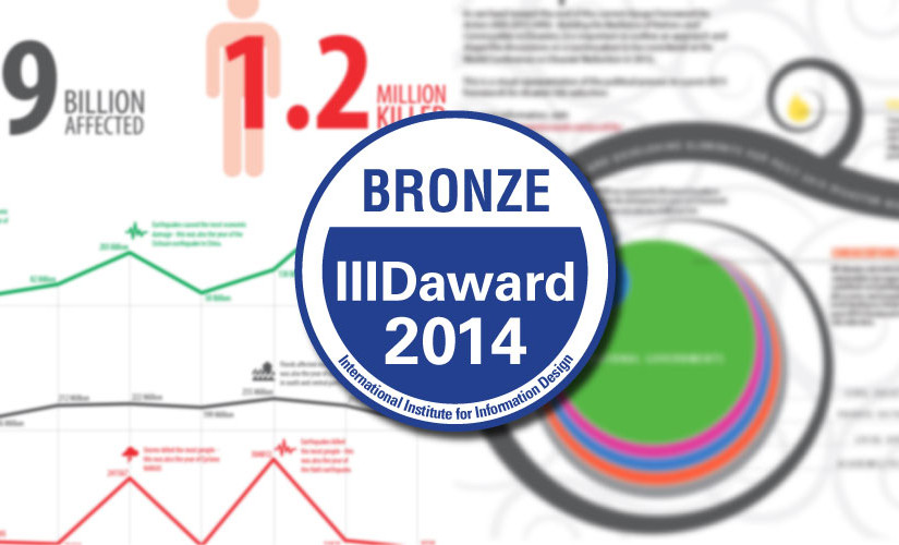
This was the philosophy I took when coming up with infographics for the United Nations Office for Disaster Risk Reduction (UNISDR). On a whim and to share my love for communicating information and data, I decided to enter a couple of infographics for the 2014 IIIDAward.

While I had an honorable mention in the 2011 IIIDAward, whaddya know, the graphics I entered this time around won third prize for two categories:
Didactics: “A timeline revisited”
This category was for projects that focus on educational or instructional information design – Download my entry here.

Editorial: “Making sense of disaster data”
This category was for projects related to media, journalism and writing – Download my entry here

The selection criteria was based on:
- Quality of the employed problem solving procedure:
– identifying the information needs of users
– making needed information available, accessible, understandable/usable
– assessing the effectiveness of the provided information, if at all possible - Attractiveness and elegance of the designed information
The IIIDAward is part of the International Institute for Information Design (IIID), a global network of individuals and organizations who are interested in optimizing information and information systems for knowledge transfer in everyday life, business, education and science. Its aims are to stimulate internationally the development, recognition and good practice of information design in its broadest sense.
