Things are changing and you might not know it even if it’s you who’s actually caused the change. Haven’t figured it out yet? Just look at what you carry everyday and what most people can’t live without these days. I’m talking about your computer, phone and/or tablet. In the last couple of decades we’ve moved from no computers to ones that we can fit in our pockets (and perhaps soon to ‘see thru’ thanks to Google). And what that means is a bit of headache in getting websites to fit the variety of formats we now use to access the internet. In a way the web has gone back to the basics… using HTML(5) and CSS. And as you’ll see, I’ve not only renamed my blog to highlight what keeps my mind buzzing, but also updated it to be more responsive.
According to Mashable, 2013 is the year of responsive web design… and the reasons are pretty clear:
Tablet sales are expected to exceed 100 million this year. Their sales numbers may top notebooks next year. Smartphones, of course, are also a hot commodity — according to Nielsen, the majority of U.S. mobile subscribers now own smartphones, not feature phones.
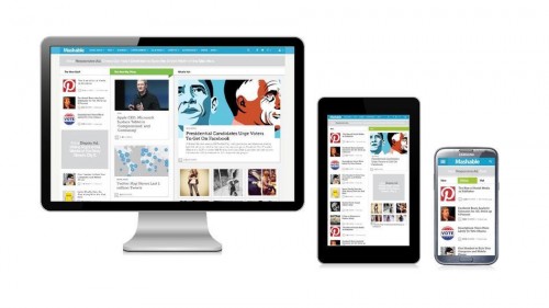
So what is responsive web design? Basically, it’s making sure that a website works across any device. Here’s a definition by Mashable in “simple terms”:
In simple terms, a responsive web design uses “media queries” to figure out what resolution of device it’s being served on. Flexible images and fluid grids then size correctly to fit the screen. If you’re viewing this article on a desktop browser, for example, try making your browser window smaller. The images and content column will shrink, then the sidebar will disappear altogether. On our homepage, you’ll see the layout shrink from three columns, to two columns, to a singular column of content.
More practically, if you’re reading this blog post on a computer, try resizing your browser and you’ll see that the website will ‘respond’ to the screen size change and will adjust accordingly. FYI, the termed was already being used in 2010 by Ethan Marcotte in this A List A Part article.
And in case you’re interested in the reference to Google Glass at the beginning of this post, here’s a clip of how it works which came out recently.