Tomorrow is October 13th. To most people, it’s just another day, but to those who believe in and work to reduce disaster risks, the 13th of October is the day to celebrate the International Day for Disaster Reduction (IDDR). This year the focus of IDDR is on some one billion people around the world who live with some form of disability. Representing one-fifth of the world’s population, persons living with disabilities (PWDs) have unique contributions, often overlooked, to help reduce the risk of disasters and build resilient societies and communities. Here’s a look at what went into the infographics to “step up” the issue.

One of the major outcomes of this year’s IDDR is a survey that was conducted to gain insight into the views of people living with disabilities and how they cope with disaster situations. The online global survey collected responses in English, French, Chinese, Russian, Spanish, Arabic, Japanese, Italian, Bahasa Indonesia, and at the same time some disability organizations ran the survey offline in Bangladesh, Thailand, and VietNam. The 22-question survey included a lot of stats and figures that ranged from understanding respondents’ disabilities to if they have a plan for disaster situations.
Over 5000 people from 126 countries made the effort, sometimes with the help of a relative or friend, to fill in the survey. With the amount of data crunching that went into the survey, it was a shame just to write about the findings. To give it more visibility, I created 3 infographics highlighting some of the major findings. The key to the visualizations was to both highlight the challenges PWDs have in dealing with disasters, but also to bring their voices to the forefront in terms of what they want for the future. With all the stats and the comments submitted, I decided to create different variations – I hate when too much information and stats are packed into graphics or text because it just defeats the purpose of communicating what’s most important.
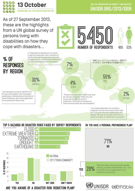
There are some interesting aspects of the overall summary that presented themselves once I finished putting the visual touches to the data and info. The first is the regional spread, which was not covered in the initial announcement of the preliminary findings, and how it shows the distribution of survey responses. Most responses came from Asia, particularly from the offline survey responses collected from Bangladesh which numbered over 1500. I also went through the comments and found ones that came from the region to give the data a little more context. The second interesting note for this graphic is the responses to the “Are you aware of a disaster risk reduction plan?” question. We didn’t see the trend in the raw data, but once I graphed it you can see that most respondents indicated that they are NOT aware of either a national or local level disaster risk reduction plan. I can understand if people didn’t know of a national plan, but not event a local one? This is a bit of a scary thought, especially for both national and local governments… I wonder what the trend would look like if the question was asked to “able-bodied” people?
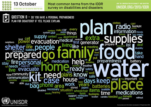
Word clouds are great – they’re both visualizing engaging and actually make you think about the issues/context. For the survey, some of the most interesting responses weren’t just the quantitative stuff, but also all the qualitative ones where people actually took the time to write down their concerns and ideas. We focused on looking at two questions in the survey. The first was Question 8 and having a personal preparedness plan. Surprisingly, 71% of respondents said they don’t. Of the 29% who said they did, the most common words that showed up in their responses were “water, plan, food, family, and supplies”, which gives a bit of sense as to what’s most important to people living with disabilities… And also what disaster responders should plan and prepare for should a disaster happen – would “able-bodied” people care about the same things?
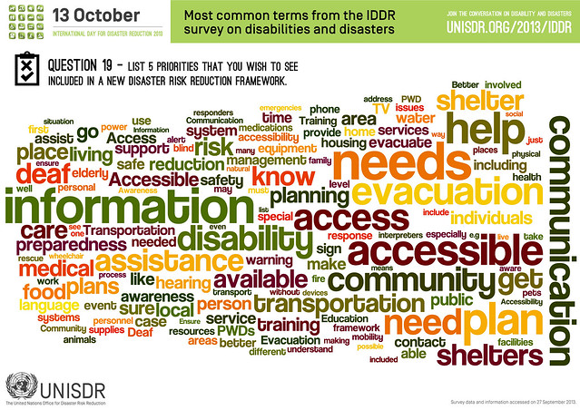
Finally, the Word cloud for Question 19 on priorities to include in a new disaster risk reduction framework holds some interesting insight. In 2015, the world will come together to adopt a new framework to succeed the Hyogo Framework for Action (2005-2015). For people living with disabilities, “information and communication” are the most common priorities they want, as well as ones that address their “needs” and making things “accessible”. In an age where information and communication is literally at our fingertips, it’s a revealing sign that people living with disabilities would like these to be a priority – does that mean information and communication technologies (ICTs) aren’t currently meeting their needs? Would “able-bodied” people be asking for the same priorities?
If you like the infographics, you can download them here.
One thought on “Behind the scenes on the 2013 IDDR infographics”