
Continuing from my last post on how data isn’t everything, visualization isn’t just about finding cool ways to show off data. “Visualization”, which seems to be a hot topic at the moment, is more than that. While it might be a buzzword that refers to showcasing data and statistics in a interesting way, I think … Continue reading Visualization isn’t just about fancy charts
Tag: design
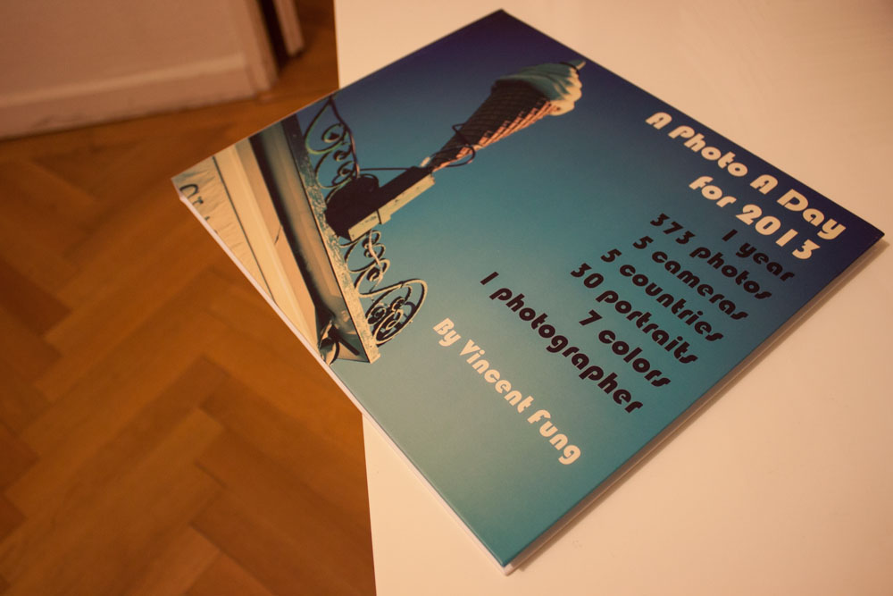
Creating a photo book is easier than you think (kind of…)
In the last 10 years or so, digital photography has exploded in terms of the variety, options, and abilities to capture memories and moments. It has really made photography (and now video) accessible to just about anyone with a click of a button – first the DSLR, then point and shoots, and now mobile phones. … Continue reading Creating a photo book is easier than you think (kind of…)
There’s an underlying stink to great design
I recently wrote about the great talent in the Communication Arts 2013 Illustration Annual highlighting three examples of my favorite work. Aside from the talented artists, the magazine features up and coming (or already well-established) freelancers, agencies, and organizations pushing the boundaries of visual communication in the digital, advertising, or marketing space. Two agencies caught … Continue reading There’s an underlying stink to great design
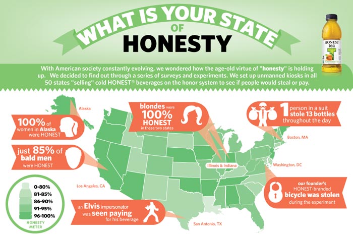
Infographics: the gourmet or fast food version?
Great cuisine is an art form with a purpose – to make us feel good and full. I had this amazing dessert in a Les Oliviers in the South of France over the Christmas holidays. It’s made of pineapple, passion fruit, cream, sugar and probably plenty of other ingredients – each of them are simple … Continue reading Infographics: the gourmet or fast food version?

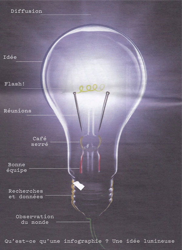
Ten principles for good design… and communication
This is one of many fake trees lit up in Geneva for Christmas. It may be a little gaudy, but it’s a great metaphor for the webbed nature of the internet and the amount of ‘new’ stuff we have at our fingertips. The fact that we can be exposed to and can search for just … Continue reading Ten principles for good design… and communication
Whether it’s print or interactive, A is for Action
Every couple of months Communication Arts comes out with their annual on advertising, photography, design, and interactive. It’s always a visual feast flipping through the Annuals and my jaw drops when I see all the creativity that comes from each book. While I’m normally not a big fan of the Interactive Annual, probably because it takes … Continue reading Whether it’s print or interactive, A is for Action
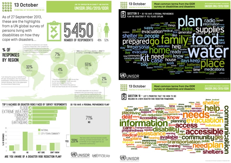
Behind the scenes on the 2013 IDDR infographics
Tomorrow is October 13th. To most people, it’s just another day, but to those who believe in and work to reduce disaster risks, the 13th of October is the day to celebrate the International Day for Disaster Reduction (IDDR). This year the focus of IDDR is on some one billion people around the world who … Continue reading Behind the scenes on the 2013 IDDR infographics
The Book: IIIDaward 2011
In 2011, the International Institute for Information Design (IIID) was celebrating its 25th anniversary. As part of its celebration and in cooperation with Axis Magazine and the Taiwan Design Center, it launched its inaugural Award for recognizing the best in what information design has to offer. The organization’s aim is to promote and expand design … Continue reading The Book: IIIDaward 2011
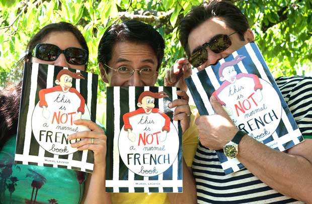
This is NOT a normal French book
I feel so proud to be a part of this book project from French My Way which started about a year ago. Little did I realize that it wasn’t just ideas that were needed to help with getting this book ready, but also practical stuff like building a website, editing the content, developing a marketing … Continue reading This is NOT a normal French book
What a blue month
Blue was for the month of July. I thought that it would be an easy month (like Green and Red), but little did I know that blue is actually a tough color to follow. It’s pretty easy to just take the picture of the sky and I did a bit of that for July. What … Continue reading What a blue month